Case Study
Makkiyoon - The new age of fine living
Brand Strategy // Identity // Expression
Calling
Approached with a sense of confusion, business instability, and an ambition for relating to the current modern times; Makkiyoon took the first step into the light. The tension lied within the need for an identity uplift through a deeper understanding of the brand.
Insight
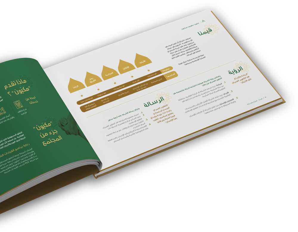
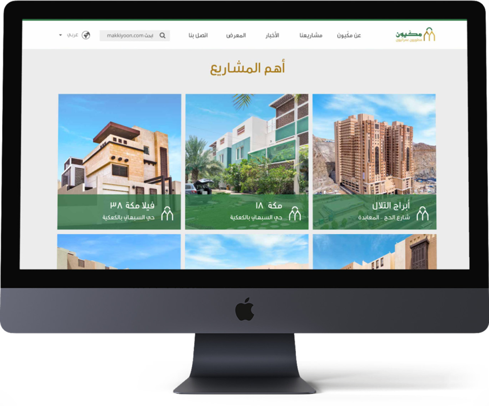
With the sole focus of providing property within the Makkah region exists an elevated position for Makkiyoon to capture. Rising to a state of nourishing and preserving spaces for a life of prosperity, accommodating fine living in the most dignified centers of the world… Makkah. This rich philosophy required a simpler and more modern translation within the brand identity, to connect with the upcoming generation.


Solution
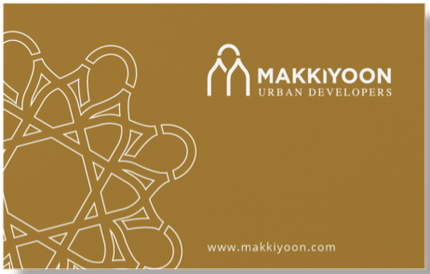
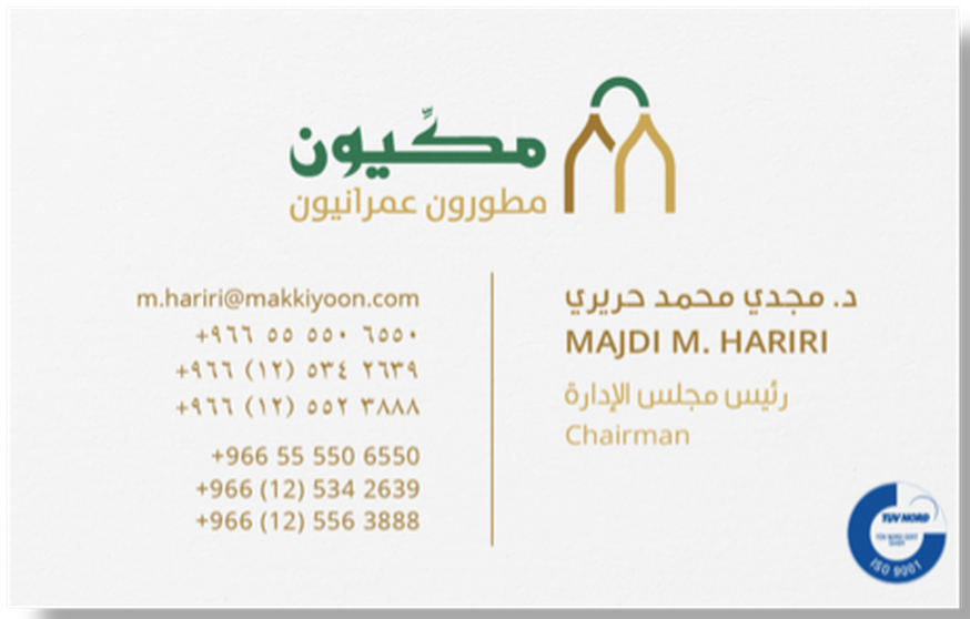
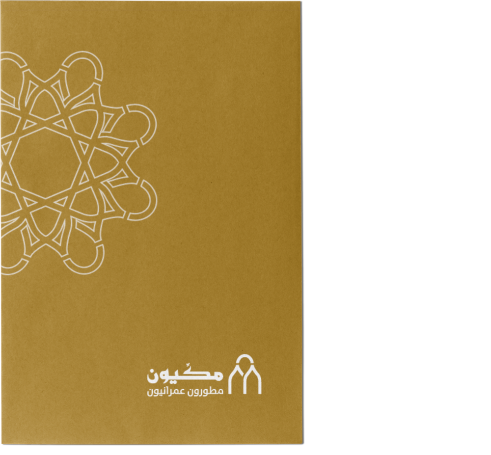
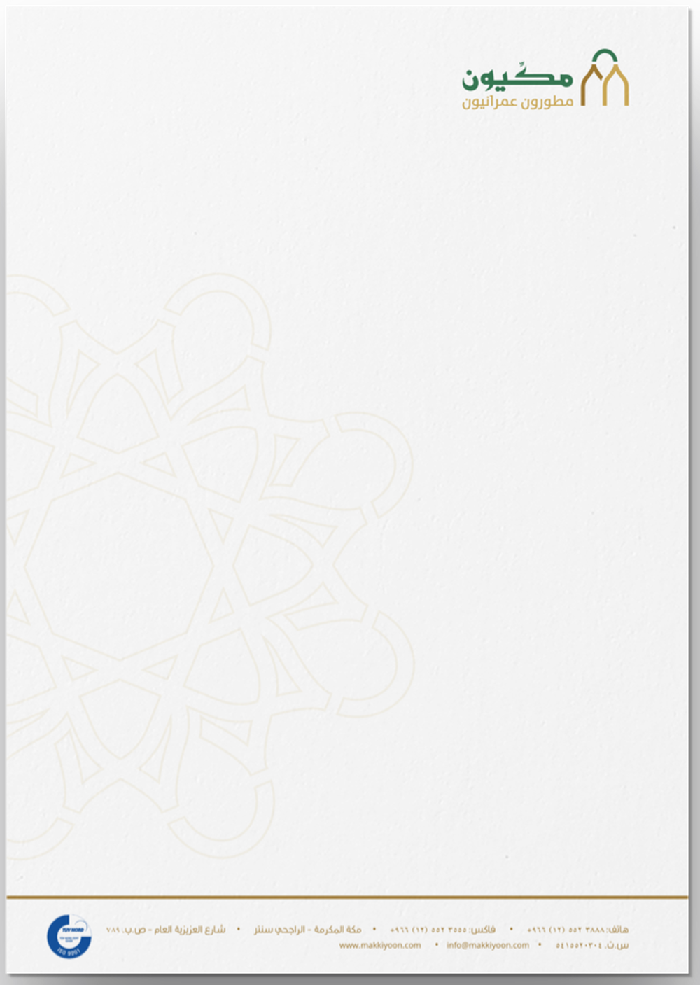
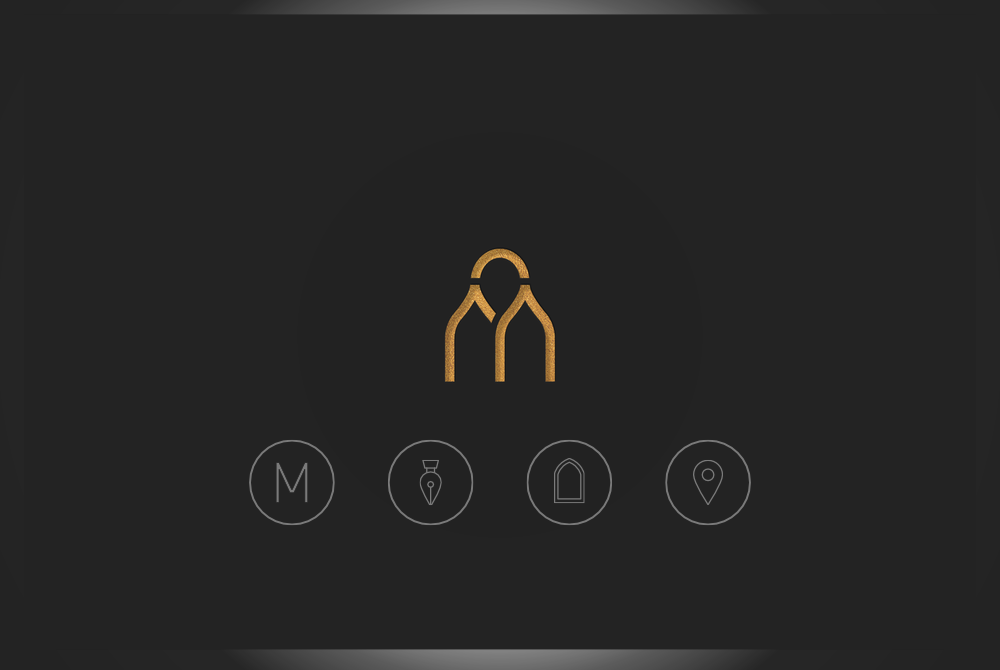
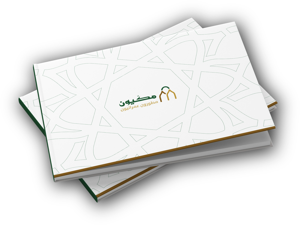
Uplifting the heaviness, the weight of the old, and embracing the new. Through the diligent preservation of the core identity, we uplifted the logo through simplifying the shapes, colors, and perspective. Merging and depicting key visual elements, whilst harnessing the power of typography for capturing the roots of the brand.
Impact
A flourishing brand identity that is able to connect to the redefined target market. The Makkiyoon uplift serves as a cherish-worthy example for brands that hold their heritage dear to their hearts and want to project their contemporary side.

Next Project.
Midwam | Connecting the future