Case Study
Crispy - Letters of Joy
Brand Identity // Expression
Calling
What resonated once, lost its sense of connection. Crispy is one of the of the most beloved brands for children of the 90's and early 2000's. For being the first and only caterer of salty multi-shaped snacks. The influx of the new generation outgrew the relevance of the brand identity. Hence, Crispy demanded a solution to connect once again to its young audience of dynamic preferences.
Insight
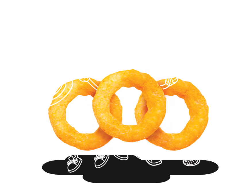
Revisiting the essence of the brand as being the captivator of nostalgia, there lies a gem of joy within, that is yet to be expressed. The essence unraveled was to "shape fun experiences that bring out the kid in us all." There was more to the brand heart, that had been silent and stagnant for way too long. The letters that once were a major part of shaping fun memories needed to shake things up.
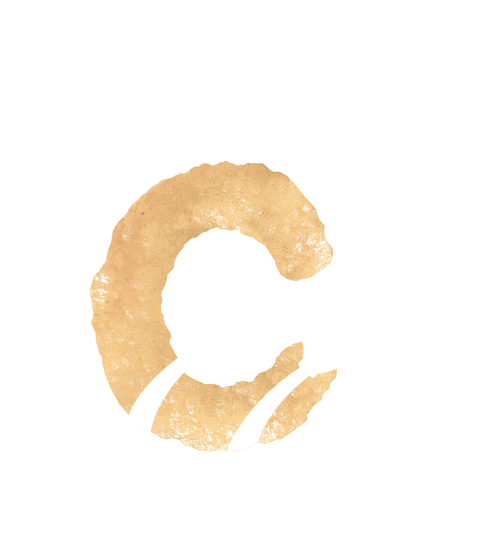
Solution
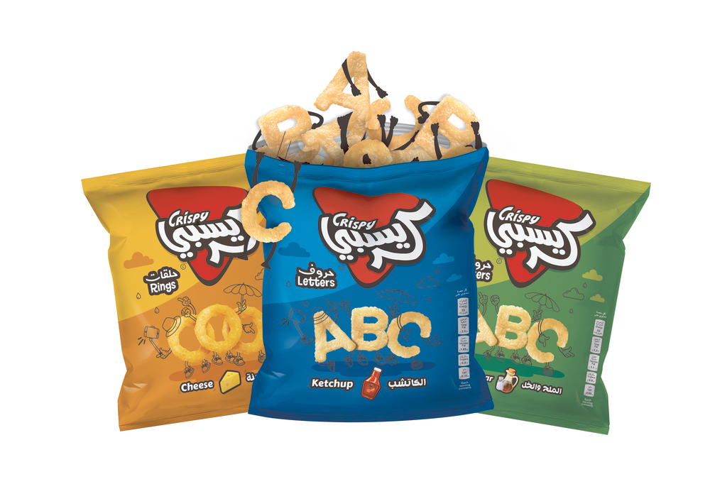
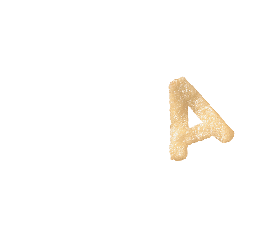
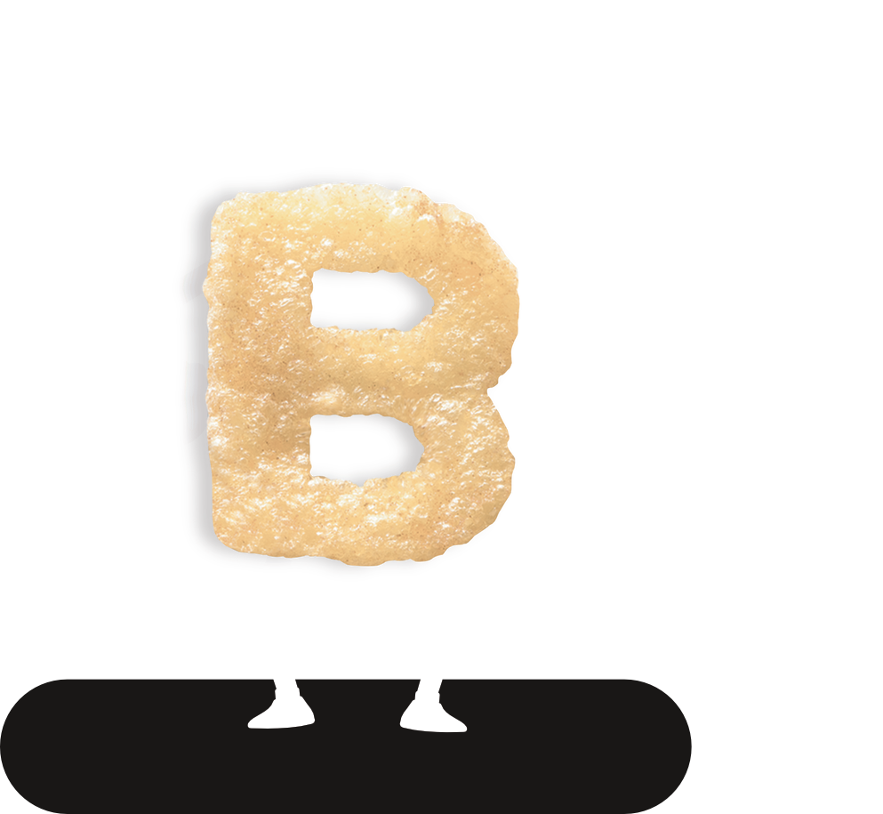
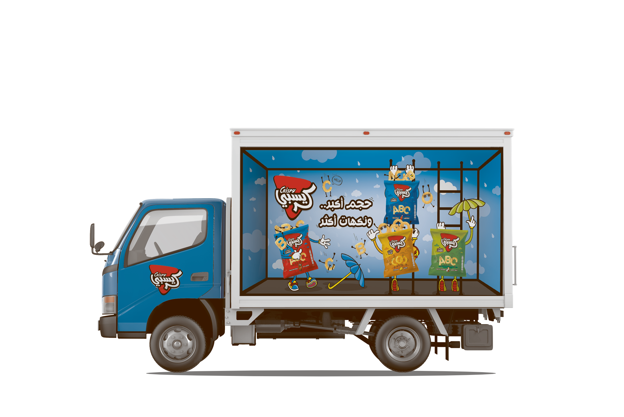
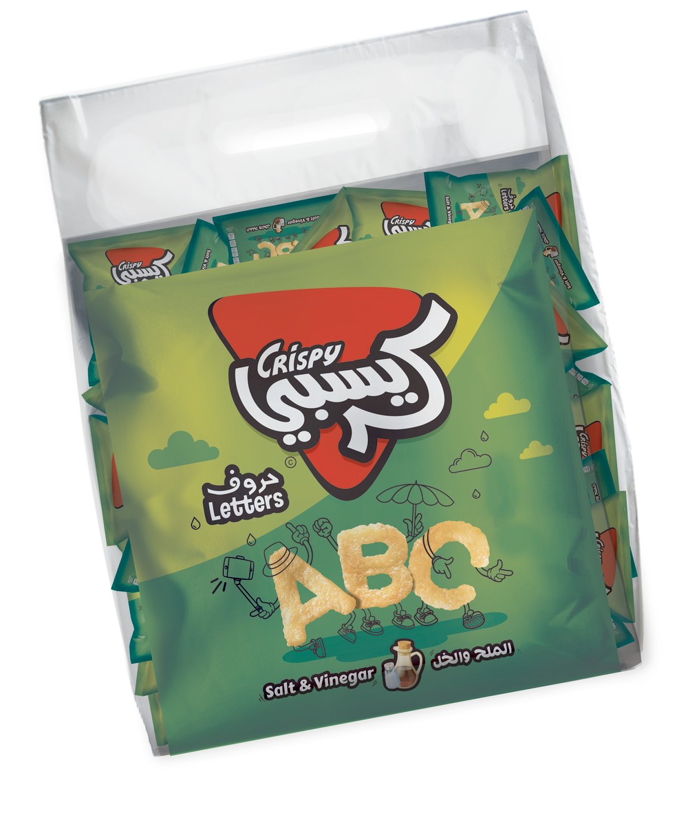
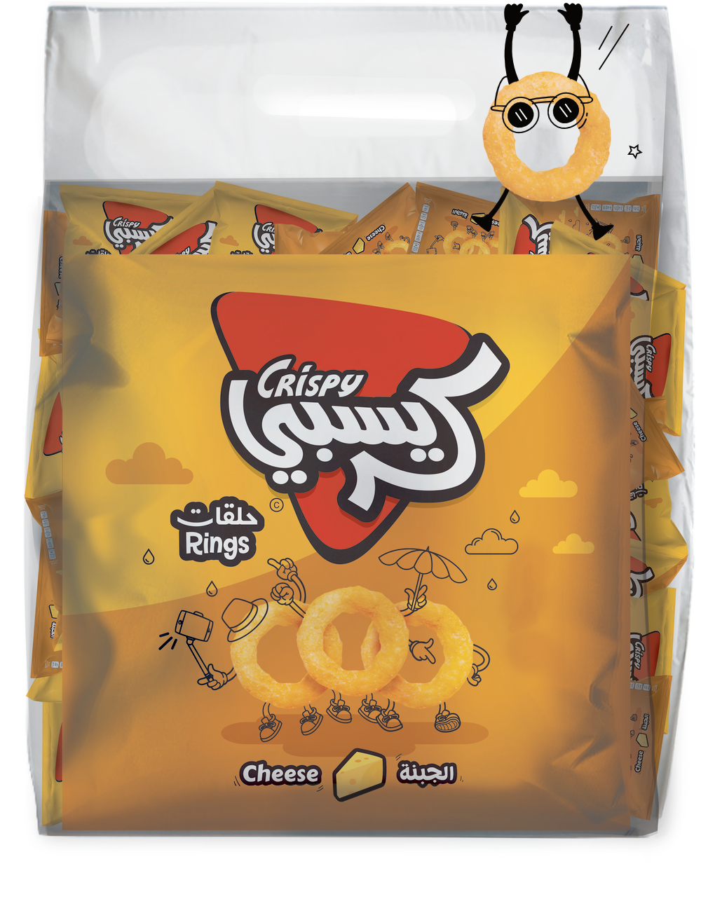
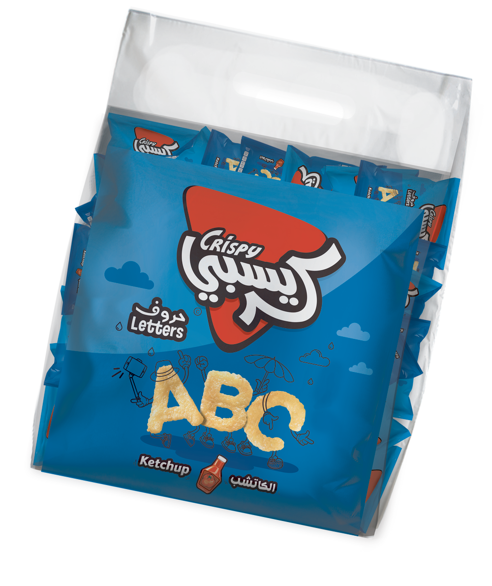
A sense of personality, life, and fun was all the brand needed. Infusing the separate language logos into one bilingual, unified the identity for greater focus. The red and black color scheme pathed the brand's entry into the modern era. The letters "horoof" don't just stand there anymore, they now dance, jump, sing, and have a great time showing it. All that's left to say is... CRUNCH! CRUNCH! CRUNCH!
The enlivened spirit of Crispy came to expression through the new packaging, external and internal communication, and even involved the welcoming of two new flavors, and more... fun!

Impact
The launch of a lifetime for a new life. The new identity worked wonders, showing greater visual fixation on in store packaging. Inferring greater favorability, intrigue, and brand engagement.
Next Project.
AutoVille | Experience Beyond